Written by Myriam van der Hoek.
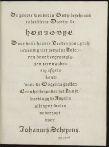
During our VisionLab at the Allard Pierson Artis Library earlier this year, we all had a look at one of the most beautiful manuscripts in the library’s collection: the bee book. Or so we call it. The official title according to the title-page reads: De groote wonderen Gods, beschouwd in het kleine Diertje, de Honingbye (The great wonders of God, seen in the little animal, the Honeybee).


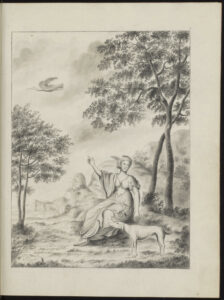
Title-page Frontispiece
The manuscript was both written and illustrated by the Amsterdam-based silversmith Johannes Schepens (1741-1810). The work consists of two volumes, one containing the handwritten text, and the other 71 watercolour drawings. Each watercolour is accompanied by a brief handwritten explanation of the image, which corresponds with the text volume (except for a few additional drawings at the end). The manuscript does not bear a date, but it was likely finished near the end of the eighteenth century.
The title of the work breathes the same sentiment as the works of many, mostly protestant, natural historians during the seventeenth and early eighteenth century. By studying the natural world you were reading the ‘Book of Nature’. This was deemed just as important as studying the bible. Even the smallest letters of this ‘Book of Nature’ should be read, so even the smallest, seemingly insignificant insects should be studied. Even, or maybe especially, these small creatures could get you closer to God’s miraculous creation. And microscopes got you even closer.
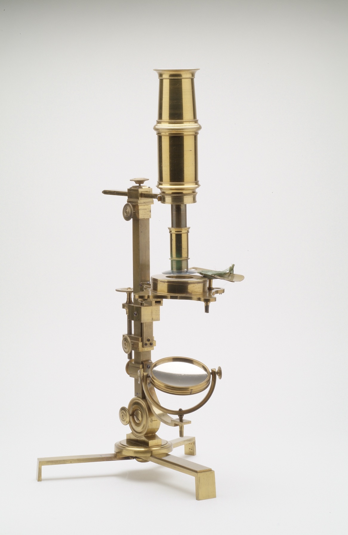
And that is exactly what Johannes Schepens set out to do. He dissected a honeybee (or probably multiple honeybees) and with the help of his self-designed microscope he examined and drew even the smallest parts. His illustrations zoom in on different parts of the bee: starting for example with the bee’s head, followed by the eye, and ending with the retina (see illustrations below). The watercolours are of extreme detail and are often a bit quite abstract.

Both volumes feel ready to be sent to a publisher: Schepens included a frontispiece with an explanatory leaf, a title page, and a note to the reader. Each watercolour has a plate number and small letters indicating the different parts that refer to the short explanation on the opposite leaf. In his foreword Schepens emphasizes that the reader shouldn’t be amazed by the images, (they were only made by a human and can be improved) but to be amazed by the original (in this case the bee), that was made by God and therefore could not be improved. He also thanks God for giving man the skill to make these drawings.
But the book was never published. In his book De ontdekking van de natuur (2021), Hans Mulder gives Schepens’ emphasis on the role of God as a possible explanation. This emphasis was probably considered outdated and ‘unscientific’ by publishers at the beginning of the nineteenth century. They might have been unwilling to publish the work, afraid it wouldn’t sell.
But during our VisionLab we came up with a second possibility as to why Schepens’ work was not published. While looking at the watercolours, we wondered how they could best be represented in print. That would have been quite a challenge. Some drawings, like the one of the abovementioned retina of a bee, lack any clear outline. What you see are mostly washes and specks of colour, with some very fine and sometimes indistinct lines. Also, most of the line work is done in a (dark) red or brownish colour. If you want the print to mimic the watercolours as closely as possible, you would be assigned to a method of colour printing.
I think we might discard relief printing as a viable method for reproducing the illustrations in this book, considering both the period and the detail of the images. Lithography might have been an option, but the technique was only just invented in 1798 by Aloys Senefelder in Germany. The very first books with lithographed illustrations published in the Netherlands date from 1817, but the technique wasn’t common until 1830 and onwards. Schepens died in 1810.
So that leaves intaglio printing. As Schepens hardly uses any black ink for the lines in his drawings, colour printing à la poupée might have been a good option. This technique entails that every incision in the copperplate had to be painted the intended colour with a tool that looked like a small doll, a poupée in French. So in a way, the copperplate was coloured, instead of hand-colouring the print after printing. This is as time-consuming as it sounds, as with every print run you had to ink/colour the copperplate in this manner. As can be seen in the images, most illustrations contain areas without line-work but consisting only of colour. In print a similar effect could be achieved by dense crosshatching, incidental use of mezzotint (as was sometimes done in botanical works), or additional hand-colouring afterwards. Another, less time-consuming, possibility could be to print the copperplates in a single colour, sepia or red for example, depending on the most prominent colour in the image, and to add the rest of the colour by hand. The trichromatic printing technique of Jacob Christoph Le Blon would have been way too time-consuming for a work on this scale, as it used up to four mezzotint plates, printed in black, yellow, red, and blue, to create a single image in colour.
We guess most watercolours were already finished by 1796, based on a letter included in the illustrations-volume to the Dutch art collector and printmaker Cornelis Ploos van Amstel. In this letter Ploos van Amstel thanks Schepens for showing him his beautiful drawings (fraye Tekeningen). It is tempting to believe that Schepens showed Ploos van Amstel his drawings with the intention of discussing a way to reproduce them. Ploos van Amstel himself had created a new technique of reproducing drawings into print, in Dutch often called the ‘prenttekening’. This type of print consisted of a combination of various methods like etching and roulette, often printed from multiple plates. It was mostly successful in reproducing chalk drawings and probably wouldn’t have been the best option for Schepens’ drawings. Again, time-consuming for the number of plates Schepens wished to include in his work…
Almost every print technique available to reproduce these watercolours was a time-consuming, and because of that, expensive endeavour. This, together with the possibility that Schepens’ work was quite outdated at the time, might have put off the publishers. Luckily the manuscript remains and we can still be amazed at what a single man and a microscope could achieve.
